Chill Bliss Dairy
BRANDING
2025
Branding
Where indulgence meets relaxation.
A branding project created for Chill Bliss Dairy, a CBD-infused ice cream brand that reimagines wellness through playfulness. Built on the belief that relaxation and fun belong together, the brand invites people to slow down, reconnect with the present, and embrace moments of joy. Every touchpoint, from the visual identity to the brand voice captures the balance between premium indulgence, calm, and keeping your inner child alive.
Art Director: Elizabeth Palma Preza

The identity of Chill Bliss Dairy was created to bridge the gap between playful indulgence and adult wellness. Its visual language combines a joyful, energetic typography system with earthy sage, olive, and mustard tones, creating a retro 70s-inspired aesthetic rooted in peace, warmth, and nostalgia.
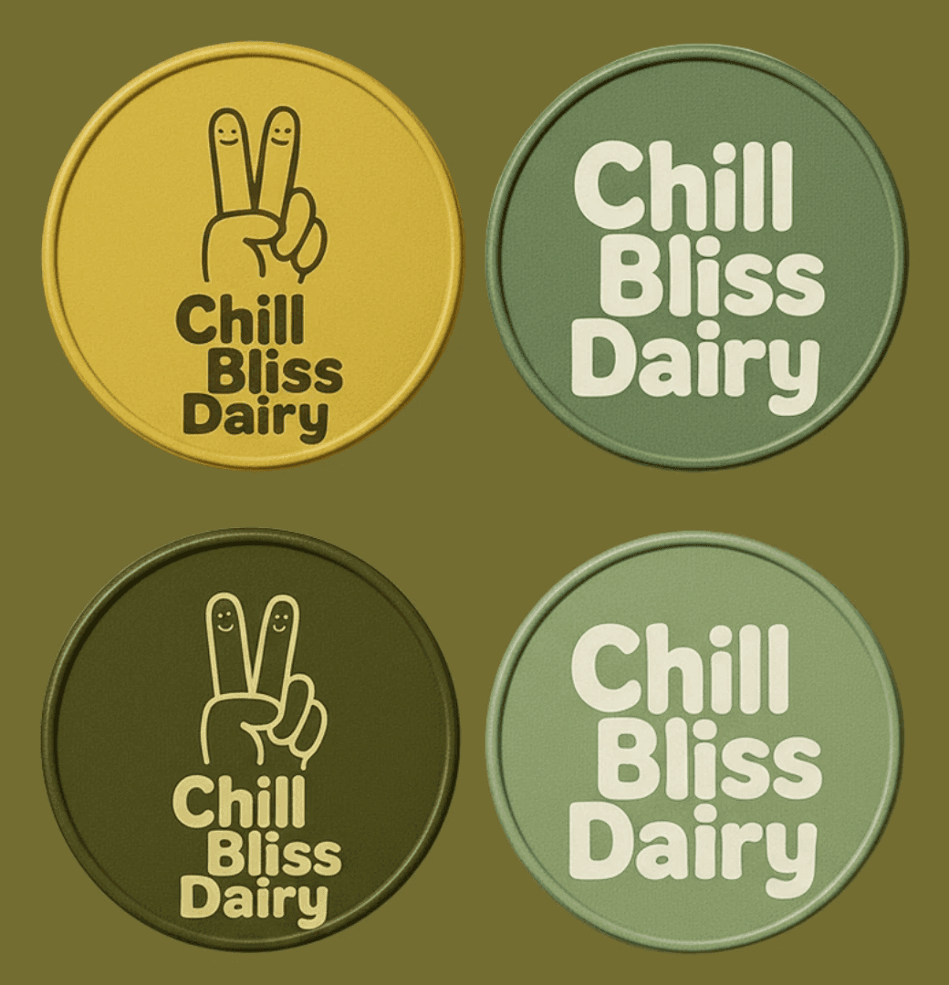
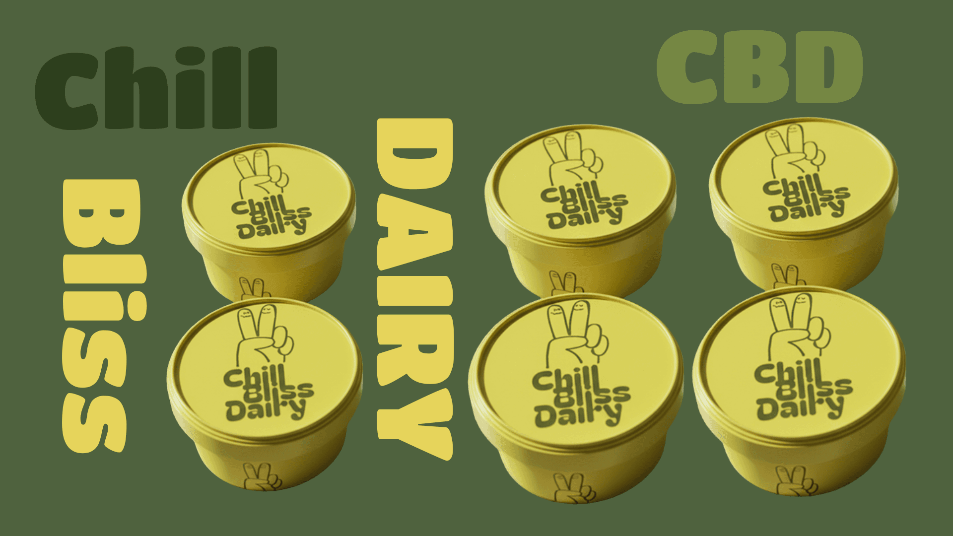
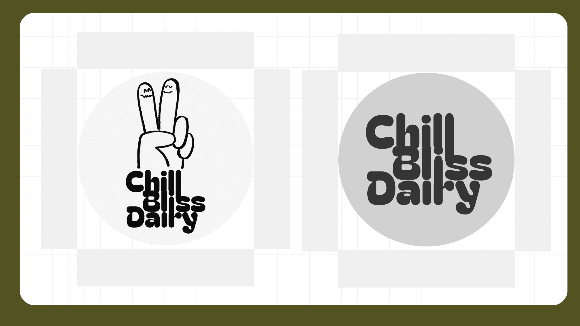
The Chill Bliss Dairy logo was designed to capture the brand’s central tension: playful indulgence and adult relaxation. Its bold, rounded lettering feels joyful and approachable, while the organic, slightly imperfect character adds a sense of spontaneity and ease. Rather than looking clinical or overly polished, the logo embraces a carefree, nostalgic attitude that makes wellness feel more fun, social, and accessible.


The identity comes to life through real world applications, particularly across the two ice cream flavors. Each presentation maintains the core Chill Bliss Dairy identity while developing its own visual expression, allowing the flavors to feel distinct yet part of the same playful, nostalgic world. From the packaging to the overall brand experience, the system makes the product feel tangible, collectible, and easy to recognize on the shelf.


